固定数量文字环绕旋转
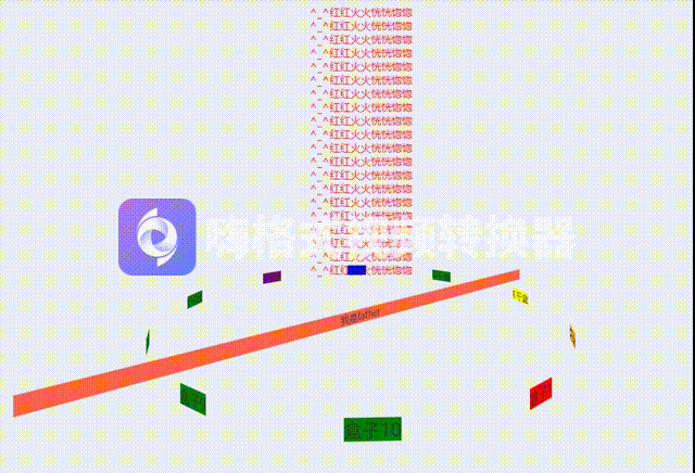
<template><div class="page"><div><div v-for="(item, index) in [...Array(20).keys()]" :key="index" style="color: red">^_^红红火火恍恍惚惚</div></div><div class="father"><span class="text">盒子1</span><span class="text">盒子2</span><span class="text">盒子3</span><span class="text">盒子4</span><span class="text">盒子5</span><span class="text">盒子6</span></div></div>
</template><script>
export default {name: 'TextRotate',components: {},data() {return {}},computed: {},watch: {},created() {},mounted() {},methods: {}
}
</script><style lang='scss' scoped>
.page {perspective: 700px;.father {width: 50%;margin: 50px auto;background-color: tomato;// 动画position: relative;transform-style: preserve-3d;// 添加动画animation: rotate 10s linear infinite;&:hover {// 鼠标悬浮动画停止animation-play-state: paused;}@keyframes rotate {0% {transform: rotateY(0);}100% {transform: rotateY(360deg);}}.text {background-color: green;// 动画position: absolute;top: 0;left: 50%;// b {// color: transparent;// }// strong {// position: absolute;// top: 0;// left: 0;// width: 100%;// height: 100%;// z-index: 1;// color: red;// }// span {// position: absolute;// top: 0;// left: 0;// width: 100%;// height: 100%;// background-color: pink;// }// i {// position: absolute;// top: 0;// left: 0;// transform: rotateY(180deg);// z-index: -1;// color: green;// }&:nth-of-type(1) {// 【问题】为什么是Z轴移动?// 【解答】盒子Y轴旋转60deg后。他的z轴也跟着转了// transform: rotateY(0deg) translateZ(300px);transform: translateX(-50%) rotateY(0deg) translateZ(300px); // X水平居中 Y轴旋转 Z轴平移形成圆background-color: red;}&:nth-of-type(2) {// 先旋转 再移动// transform: rotateY(60deg) translateZ(300px);transform: translateX(-50%) rotateY(60deg) translateZ(300px); // X水平居中 Y轴旋转 Z轴平移形成圆background-color: orange;}&:nth-of-type(3) {// 先旋转 再移动// transform: rotateY(120deg) translateZ(300px);transform: translateX(-50%) rotateY(120deg) translateZ(300px); // X水平居中 Y轴旋转 Z轴平移形成圆background-color: yellow;}&:nth-of-type(4) {// 先旋转 再移动// transform: rotateY(180deg) translateZ(300px);transform: translateX(-50%) rotateY(180deg) translateZ(300px); // X水平居中 Y轴旋转 Z轴平移形成圆background-color: green;}&:nth-of-type(5) {// 先旋转 再移动// transform: rotateY(240deg) translateZ(300px);transform: translateX(-50%) rotateY(240deg) translateZ(300px); // X水平居中 Y轴旋转 Z轴平移形成圆background-color: blue;}&:nth-of-type(6) {// 先旋转 再移动// transform: rotateY(300deg) translateZ(300px);transform: translateX(-50%) rotateY(300deg) translateZ(300px); // X水平居中 Y轴旋转 Z轴平移形成圆background-color: purple;}}}
}
</style>
不固定数量文字环绕旋转
<template><div class="page"><div><div v-for="(item, index) in [...Array(20).keys()]" :key="index" style="color: red">^_^红红火火恍恍惚惚</div></div><div class="father">我是father<spanv-for="(item, index) in [...Array(count).keys()]":key="index"class="text":style="`transform: translateX(-50%) rotateY(${(360 / count) * index}deg) translateZ(300px)`">盒子{{ item + 1 }}</span></div></div>
</template><script>
export default {name: 'TextRotate',components: {},data() {return {count: 10 }},computed: {},watch: {},created() {},mounted() {},methods: {}
}
</script><style lang='scss' scoped>
.page {perspective: 700px;.father {// display: inline-block; // .father 内没有内容/内容过少(即宽度小)的话:由于 .text 的宽度和 .father 宽度一样,会导致 .text 中文字换行width: 50%;margin: 50px auto;background-color: tomato;// 动画position: relative;transform-style: preserve-3d;// 添加动画animation: rotate 10s linear infinite;&:hover {// 鼠标悬浮动画停止animation-play-state: paused;}@keyframes rotate {0% {transform: rotateY(0);}100% {transform: rotateY(360deg);}}.text {background-color: green;// 动画position: absolute;top: 0;left: 50%;// b {// color: transparent;// }// strong {// position: absolute;// top: 0;// left: 0;// width: 100%;// height: 100%;// z-index: 1;// color: red;// }// span {// position: absolute;// top: 0;// left: 0;// width: 100%;// height: 100%;// background-color: pink;// }// i {// position: absolute;// top: 0;// left: 0;// transform: rotateY(180deg);// z-index: -1;// color: green;// }&:nth-of-type(1) {// 【问题】为什么是Z轴移动?// 【解答】盒子Y轴旋转60deg后。他的z轴也跟着转了// transform: rotateY(0deg) translateZ(300px);transform: translateX(-50%) rotateY(0deg) translateZ(300px); // X水平居中 Y轴旋转 Z轴平移形成圆background-color: red;}&:nth-of-type(2) {// 先旋转 再移动// transform: rotateY(60deg) translateZ(300px);transform: translateX(-50%) rotateY(60deg) translateZ(300px); // X水平居中 Y轴旋转 Z轴平移形成圆background-color: orange;}&:nth-of-type(3) {// 先旋转 再移动// transform: rotateY(120deg) translateZ(300px);transform: translateX(-50%) rotateY(120deg) translateZ(300px); // X水平居中 Y轴旋转 Z轴平移形成圆background-color: yellow;}&:nth-of-type(4) {// 先旋转 再移动// transform: rotateY(180deg) translateZ(300px);transform: translateX(-50%) rotateY(180deg) translateZ(300px); // X水平居中 Y轴旋转 Z轴平移形成圆background-color: green;}&:nth-of-type(5) {// 先旋转 再移动// transform: rotateY(240deg) translateZ(300px);transform: translateX(-50%) rotateY(240deg) translateZ(300px); // X水平居中 Y轴旋转 Z轴平移形成圆background-color: blue;}&:nth-of-type(6) {// 先旋转 再移动// transform: rotateY(300deg) translateZ(300px);transform: translateX(-50%) rotateY(300deg) translateZ(300px); // X水平居中 Y轴旋转 Z轴平移形成圆background-color: purple;}}}
}
</style>
效果图